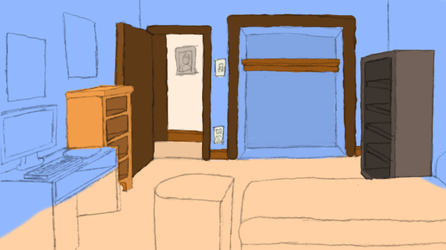
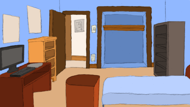
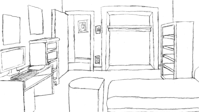
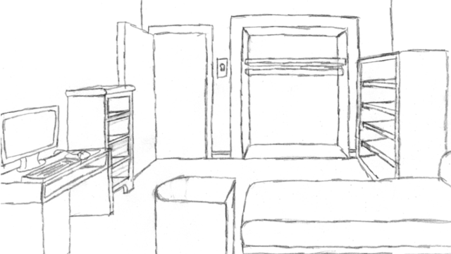
Enchanted Lands - Attempt at enchanted animation.
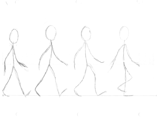
October 6th, 2007

This is junky, after fooling around with gimp for several hours i finally got the animation part working fine. Then I noticed that part of it is cut off. Of course the animation sucks. I tried to do as limited as possible and then inbetween it. it started out with 4 frames then the 4 inbetweens. But some of the poses are so similar it doesn’t really look like he’s walking. I think i’ll attempt to just do it straight ahead this time. We will see.

But here’s a sample of what I did.

Edit October 9th, 2007:
I did another version, I was sure would work right, but guess what, it looks like he’s skipping - WHEEEEeeee!!!
Note: I used the space beside the old one for comparison, and also so I wouldn’t waste paper.

Edit October 10th, 2007:
Well technically it’s still the 9th, I just figured it was so close to midnight that I would go ahead and say it’s the 10th Makes it look like I did this at another date ;-) Here’s the third attempt on the far right, this one has almost made it but I went too far, so then it doesn’t look like it connects to the first frame for a smooth loop. But it’s a start. I may go ahead and do the 4th by hand.

Edit October 10th 2007 — For real:
The fourth one I tried to be adventurous and try starting out on a different frame, now he REALLY looks like he’s skipping. Whoops I biffed it again. I guess I’ll try to copy it out of a book or something.

#4

Keith

A small work in progress — a start at shading.

October 1st, 2007

Starting to shade

I’m really in uncharted territory here now — shading. I attempted a few things, one is the walls, basically the light is more or less coming from directly overhead… more towards the dresser than the foreground objects.

I’m not sure what i’m supposed to be doing here. I have an idea of where the light source is, and i’m purposely not adding shadows yet. The walls, and the side of the dresser (the one on the left) I tried to do two things on the dresser, one is have it go from dark (that upper lip on the side) to light, as there’s a bit of a shadow, but even that is probably incorrect since the light is above. The other thing is the walls… local shading on the walls, dark towards the bottom lighter at the top. I started with a little “burning”, and then used the smudge tool to mush it out.. Also on the dresser I tried to add a highlight to the top of the dresser itself.

Really I just want some suggestions. Ideas and tutorials on shading digitally (not shadows) and specifically using the mouse… I don’t have a tablet nor money to buy one.

Thanks,
Keith

John’s Room Work in progress #2

September 23rd, 2007

Okay so basically i had another go at it. I changed a few of the colors, I straighted some lines, it’s almost starting to look decent. Tell me what you think.

First one with the line drawing removed.
WIP 1

Second with 50% lines
WIP 2

Third fully opaque line drawing over the top.
WIP 3

Give me suggestions, thoughts, or opinions.
Keith

John’s room work in progress #1

September 19th, 2007

Okay I started a basic paintover, using the technique of putting the sketch on a layer above the painting using multiply which basically means the white shows through and i can paint under the sketch lines.

I just decided to do it to show a friend, but if you’re curious — this part isn’t even finished yet… But I will work on it until it’s perfect.

WIP 1
John's room WIP 01

WIP 2
Johns room WIP 02

WIP 3
John's room WIP 03

Actually the basic color blocking is generally complete until I get some feed back suggesting I change it before starting to apply shadows and so forth.

To make it less confusing, on the left side beside the computer desk is the dresser (it’s the sort of light brown one). Notice how it’s shelves are more holes than shelves, they come to the edge and are seperated by the front of the dresser. on the right side the gray thing is the bookcase, notice how the shelves are set in the case back from the edge. Someone in the ags forums critic’s lounge suggested I do this (maybe because of bad tangents or something) in any case I like it, it actually makes it look like a book case.

Basically this is the empty room before it gets all messy and the main character has to clean it up. that’s why there are no drawers in the dresser or books on the shelf.

The color choices are abit based on experience. the dresser is a lighter wood, to contrast with the dark wood of the door and the trim, the bookcase is gray just to make it a bit different. I made the desk something like mahogony or cherry, by adding a reddish tint, so that way it wasn’t completely brown. At one point in my life my walls were light blue with a light brown or tan floor (well the floor doesn’t look tan exactly but close enough). On the hole I think it’s decent. Note the dresser, bookcase, and door all have lighter tint on their sides, whereas the bed and the hamper and desk are darker on the sides facing the camera, not really sure if this is a good idea, but it makes me think that the foreground objects are closer to the camera, you can let me know if it isn’t right.

Let’s see… the hallway is on a single layer, the door is on it’s own layer, the trim around door and closet are in it’s own layer, trim around the bottom and outlet and switch are on it’s own (same) layer… I basically put alot of things in their own layers, such as the insides of the bookcase, dresser, and desk… and then some of the sides. the walls and the floor are the same as well… not really experienced with this software, using the gimp with a mouse but it seems to work. at one time i thought of actually putting every white/negative space (any space bordered with lines to form a shape) on a seperate layer, but that may be overkill.
In fact this may be overkill.

I’ll probably start working on the actual shading in a bit, the light is pretty much coming from the light bulb, that you can’t see in the picture… Any thoughts are appreciated, thanks!

Keith

Fade In - Back in business

August 27th, 2007

Thanks to Mr. Stephen Stair, I have a new location for my blog. Hopefully when the name servers propagate through the internet this post will come up and you won’t even know the difference.

Give him a round of internet applause! ;-)

He’s a fellow programmer, with his own blog there in the friends list.

Keith

ps. testing testing, 1-2-3

Black sketch #2

August 19th, 2007

Well here it is, black sketch number 2… things have been adjusted again… this time the quality may look a little worse, because I was attempting to not use sketchy lines, which produces crappy non-straight lines, verses sketchy straight ones… in any case this one is better in the fact that I added the details to the door, posters, and then I added some extra width to the computer desk, as well as decreased the depth and width of the book case, so now lines don’t meet exactly… Hopefully this is more satisfactory.

number 2

Keith

Continuing to post —

August 18th, 2007

I’m going to post anyways… i’ll fill in the rest of the posts if I can get my blog onto another webhost.

First black pencil sketch… Not sure how the final clean up is going to turn out, but I modified this sketch a bit… made the dresser only 4 drawers and the bookcase only 5 shelves… the hamper has changed shape to be a bit more dynamic, and I even made the closet seem a bit smaller.

first black sketch

Keith

Fare thee well

August 17th, 2007

Looks like my hosting is going to go down for good, and so I don’t know how long the blog will be here. I’ll have to either restart or restore the whole database and all on a new webhost, which most likely will cost money. In any case thanks you few who actually have been reading.

Keith

Enchanted try #4

August 16th, 2007

Okay let’s try this again, I think i’ve almost nailed it. I also did something that might be a little risky. I changed the bed around to the front, and added a book case in the back. then moved out the hamper into the middle. So basically it’s framed by some foreground objects, it’s got everything I wanted in it, and it’s got 1 more item (the book case), also the door may open, and the closet looks normal (I hope). Still just a sketch, there are a few issues, for instance, the drawer on the computer desk, i had it closed but since you’ll be able to fool around with stuff, then I hollowed it out. I left the handle on the computer compartment because i’m not expecting someone to look in there… In fact I may remove the handle, just having the computer behind the compartment or shelf should be enough. (We can theorize how you get the dern computer out of there till the cows come home, but I don’t think it will make much of a difference). Notice it’s almost completely bare room, including the bed. This is on purpose. Also I think it will still be easy to move around. Of course, i’ll still have to be extra careful where i put the pizza box with a couple of old moldy slices still in it, and the clothes and what not, probably limited to what you can see, except if I decide you can search under the bed (might work). So you have to clean up your room, and then find your library card.

Anyways let me know what you think.
4th try

Keith

Enchanted try number 3…

August 15th, 2007

Well actually i kept wasting paper because I kept getting either too close, or not wide enough or whatever… The last image was good but it didn’t actually have a door, uhoh, big mistake.

I think this new one is the best as far as getting everything in there. I think I will attempt to make a black (regular pencil) tracing of it and add any details I need to add before getting C&C and then inking it.

Let me know what you think.

Next try

Keith