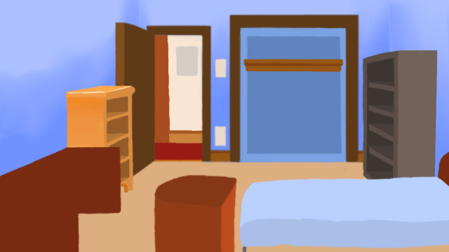
A small work in progress — a start at shading.

I’m really in uncharted territory here now — shading. I attempted a few things, one is the walls, basically the light is more or less coming from directly overhead… more towards the dresser than the foreground objects.
I’m not sure what i’m supposed to be doing here. I have an idea of where the light source is, and i’m purposely not adding shadows yet. The walls, and the side of the dresser (the one on the left) I tried to do two things on the dresser, one is have it go from dark (that upper lip on the side) to light, as there’s a bit of a shadow, but even that is probably incorrect since the light is above. The other thing is the walls… local shading on the walls, dark towards the bottom lighter at the top. I started with a little “burning”, and then used the smudge tool to mush it out.. Also on the dresser I tried to add a highlight to the top of the dresser itself.
Really I just want some suggestions. Ideas and tutorials on shading digitally (not shadows) and specifically using the mouse… I don’t have a tablet nor money to buy one.
Thanks,
Keith
October 2nd, 2007 at 8:00 am
Have you done any non-digital drawing? I figure that it is just a matter of translating what I know there to the digital world. I like the shading of the walls, which shows that the light gets dimmer as you get farther away from it.
I really like how it is turning out. It has charm!