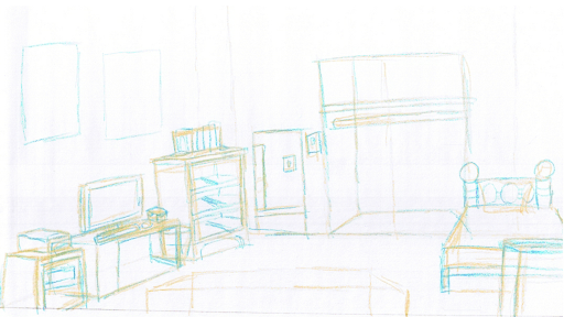
Enchanted first room sketches
Well you probably know by now, but the way i’m doing my rooms are i’m doing some concept thumbnails to get the layout I want, then proceed with what i call the “yellow” sketch… I use a yellow colored pencil and block in the major shapes. Then it’s on to blue sketch, where I add details, before finally going over for an initial trace… then this should be where i get all the major details in before doing a clean up and and ink.
I just want to know from any of you whether this looks okay or not, perspective-wise… realizing it’s a sketch and not even the final at that. I modified the layout slightly which gives the character more walking room… the hamper is on the side in front of the bed, and you can actually see mos of the bed now. Note you can see into the closet which is empty, and out the door into the hallway, as well as the drawer cavities (or whatever you call them)… and then of course some spots for posters. I plan to add the extra stuff like door, closet door, drawers covers on the bed, lid to the hamper, and actually the posters themselves probably as seperate elements… Actually the posters will be created on normal sheets, then the images scaled, shrunk and perspective corrected to fit on the wall correctly, but that’s way later. Also the computer desk chair will be added later. I had also blocked out some sort of book case or something for the foreground, but not sure if i will add anything.
Let me know what you think.

Keith
August 14th, 2007 at 7:33 am
It definitely looks roomier! I’m curious about the use of yellow and then blue pencils. Is that a standard practice, or is it something you’ve come up with?
The door leading out to the hallway should be as tall as the closet. I think the closet looks like it has a top shelf area, so the door to the hallway looks like it needs to be only a little taller. Otherwise, the closet is HUGE! B-)
Will you be able to look at the individual posters and pictures on the walls?
August 14th, 2007 at 9:22 am
the yellow and blue pencils is something I came up with, it’s to allow me to see the image before making any final decisions.
I think I have the perspective wrong, so i’m going to redo it. And yes the closet looks a little too big.
Yes you should be able to look at the posters, when i’m done.